Design 4 min read
Typography Tricks That Make Your Postcards Readable at a Glance

EDDM Omaha Team
Design Team

The 3-Second Readability Standard
If a recipient cannot read your headline, offer, and phone number within 3 seconds, your postcard gets recycled. Bad typography is one of the leading causes of underperforming mailers.
5 Essential Typography Rules
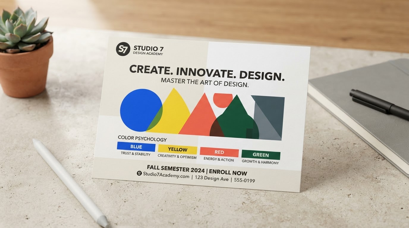
- Rule of Contrast: Dark text on light backgrounds or bright white text on solid dark backgrounds. Never place dark text over busy images.
- Maximum 2 Font Families: Use one strong sans-serif or display font for headlines and a clean, legible font for body copy.
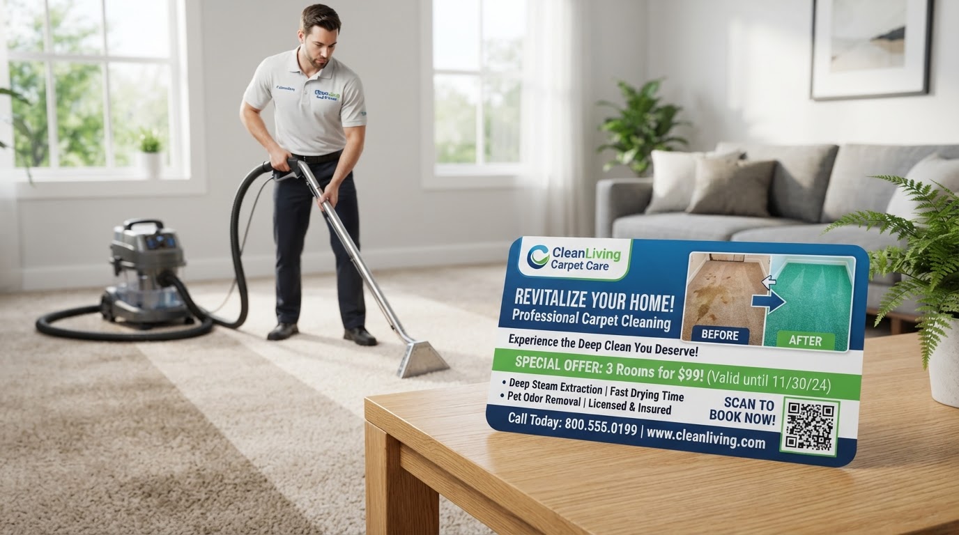
- Size Matters: Phone numbers and main headline hooks should be at least 32pt+ so they command immediate visual weight.
- Generous Line Height & Spacing: Give text room to breathe. Crammed text creates visual fatigue.
- Bold the Offer: Ensure your coupon or incentive jumps off the card visually.
Topics:Postcard TypographyDesign TricksReadabilityDirect Mail Layout
Turn This Guide Into a Campaign
Ready to put these ideas to work? Explore the EDDM Omaha services that match this article:
Written By
EDDM Omaha Team
Design Team
Adil Moussa has 23+ years of real-world marketing and customer acquisition experience helping local Omaha businesses drive visibility, phone calls, and revenue through strategy-driven direct mail and EDDM campaigns. He is the Founder of HuskerPrint and HuskerPay.