Using Color Psychology to Boost Your Direct Mailer Response Rates in Omaha

Color psychology can transform your EDDM postcards from just another piece of mail into an eye-catching asset that drives immediate response across Omaha homes. When you choose colors that spark distinct emotional reactions—like trust, urgency, or prosperity—your direct mail mailers become more engaging, naturally producing higher response rates with zero added cost per mailer.
The 85% Buying Decision Rule in Direct Mail
Research highlighted by industry analysts like Woven Insights demonstrates that up to 85% of consumers cite color as a primary reason for buying products or responding to promotional messages. Furthermore, studies by Satyendra Singh published in Impact of Color on Marketing reveal that up to 90% of snap judgements are based on color alone.
Why Color Matters in the Omaha Stack of Mail
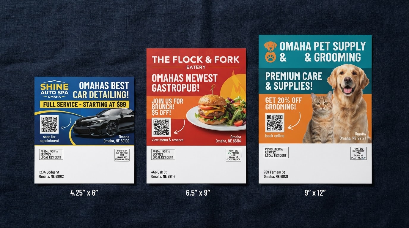
When an Omaha resident picks up their mail at the end of the driveway, your card has under 2 seconds to make a impression. Color choice creates immediate visual contrast against white window envelopes and plain utility bills. Data from WebFX reveals that colorful advertisements are viewed 42% more often than monochrome pieces.
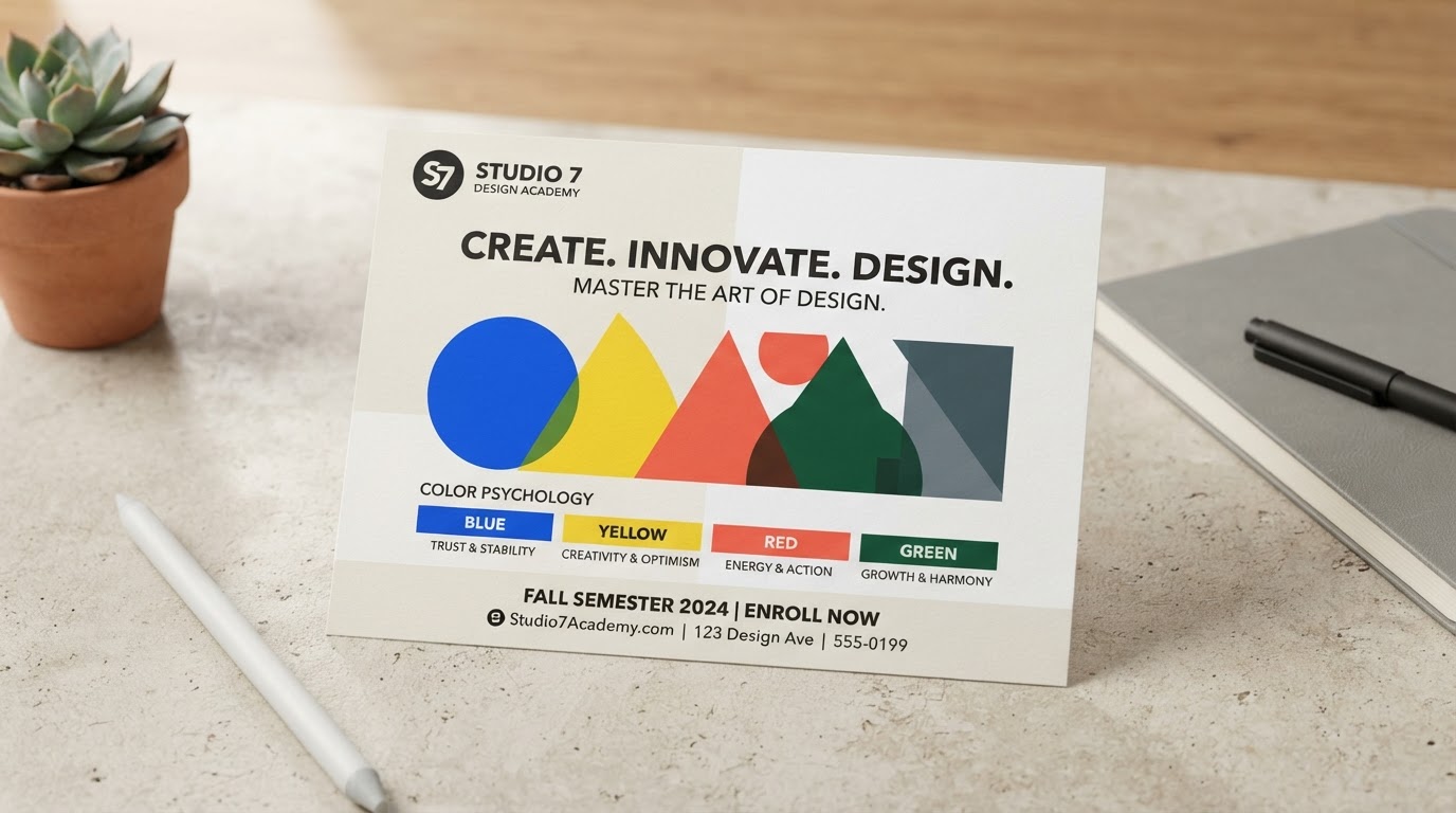
The 4 Core Psychological Colors in Mailer Design
🔴 Red: Urgency & Energy
Red stimulates heart rates and creates immediate action triggers. Studies in Color Research & Application show red sparks excitement—ideal for "Limited Time Offer" call-to-action banners for HVAC, roofing, and emergency services.
🔵 Blue: Trust & Reliability
Blue conveys authority and security. It is the preferred shade for CPAs, law firms, healthcare practices, and financial advisors seeking to build long-term confidence.
🟢 Green: Growth & Health
Green symbolizes fresh beginnings, prosperity, and vitality. Excellent for landscaping contractors, eco-conscious home services, and dental practices.
🟡 Yellow: Optimism & Visibility
Yellow grabs attention instantly and projects cheerfulness. Perfect for real estate new listings, local restaurant promos, and grand opening cards.
The 60-30-10 Rule for Balanced Postcard Design
To avoid visual clutter, top graphic designers apply the golden 60-30-10 ratio:
- 60% Dominant Background Color: Clean neutral or primary shade (e.g., crisp white or deep navy).
- 30% Secondary Supporting Color: Structural elements, subheadings, or card borders.
- 10% Vibrant Accent Color: High-contrast color exclusively for your primary CTA button, phone number, or QR code container.
Want to learn more about layout and readability? Check out our guide on Typography Tricks That Make Your Postcards Readable at a Glance to pair perfect color palettes with high-converting fonts.
Color Palette Guidelines for Omaha Industries
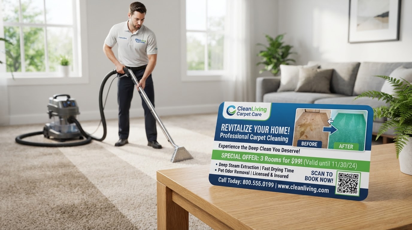
- Home Cleaning & Lawn Care: Bright green + sky blue + yellow CTA badge.
- HVAC & Plumbing: High-contrast red/blue split (heating/cooling) with white typography.
- Restaurants & Bars: Warm reds, oranges, and deep burgundy to stimulate appetite.
- CPAs & Legal: Navy blue, slate gray, with gold accent touches for premium positioning.
Launch High-Impact Postcard Campaigns with EDDM Omaha
At EDDM Omaha, our team helps local businesses select color-tested postcard templates, identify high-converting carrier routes, and execute flawless oversized mail drops across Douglas and Sarpy counties.
Turn This Guide Into a Campaign
Ready to put these ideas to work? Explore the EDDM Omaha services that match this article:
Adil Moussa
Adil Moussa has 23+ years of real-world marketing and customer acquisition experience helping local Omaha businesses drive visibility, phone calls, and revenue through strategy-driven direct mail and EDDM campaigns. He is the Founder of HuskerPrint and HuskerPay.