Using Bold Colors and Fonts to Drive More Postcard Responses in Omaha

Using bold colors and the right typography can dramatically increase your direct mail response rates. When a postcard lands in an Omaha homeowner's mailbox, it has roughly 3 seconds to command attention before it gets set aside.
Vibrant, high-contrast colors combined with clean, readable typography give your message an immediate competitive edge. According to direct mail research, colorful postcards can achieve up to 42% higher response rates than plain or low-contrast versions.
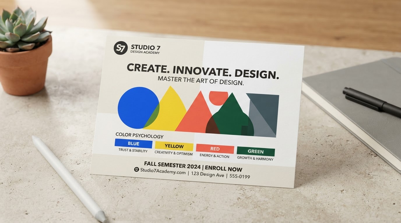
Color Psychology in Marketing: Hues That Prompt Action
Color choices heavily influence decision-making at the mailbox. People judge direct mail in split seconds, and strategic color selection helps guide their response:
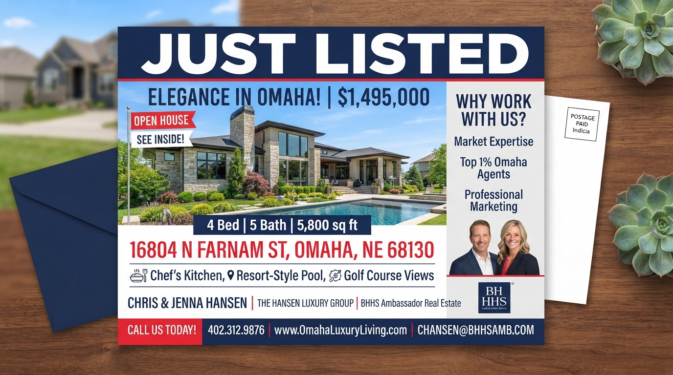
- Deep Blue & Navy: Signals trust, reliability, and security. Excellent for financial services, legal, and luxury home offers.
- Vibrant Red & Orange: Creates urgency and energy around limited-time seasonal promotions or discount offers.
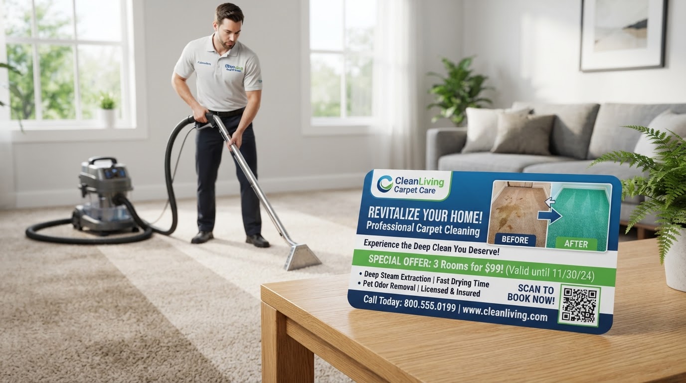
- Fresh Green: Represents growth, cleanliness, and value. Ideal for lawn care, landscaping, and home cleaning services.
An analysis published by Data Force Research found that colored mail pieces increased response rates by roughly 9.1% compared to standard white backgrounds.
Effective Font Choices for Direct Mail
Typography plays a vital role in quick scanning. For maximum readability, stick to clean sans-serif typefaces for headlines and supporting copy:
Top Sans-Serif Fonts for High-Response Postcards
- ✓ Helvetica / Arial: Extremely legible across large headlines and small print.
- ✓ Century Gothic: Clean, modern geometry that looks premium and approachable.
- ✓ Verdana: Generous character spacing ensures readability even at smaller point sizes.
Place your primary offer in a bold, oversized weight so it instantly anchors the reader's eye. Pair it with a slightly lighter weight for secondary benefits. For specific copy formatting techniques, check out our guide on Typography Tricks That Make Your Postcards Readable at a Glance.
High-Converting Sample Postcard Headlines
Short, direct headlines perform best because space is valuable and attention is brief. Here are industry-proven examples:
- Roofing & Home Services: "Need a Roof Inspection After the Storm? Get Your Free Estimate Today & Save $250."
- Dental & Medical: "New Patient Special: $99 Exam & X-Rays. Book Online in 60 Seconds."
- Real Estate: "Just Listed in West Omaha! Tour This 4-Bed Home Before It's Gone."
Want Professionally Designed EDDM Postcards?
Our team handles strategy, color selection, oversized print preparation, and USPS mailing so your campaign gets noticed.
Get My Free Campaign Plan →Turn This Guide Into a Campaign
Ready to put these ideas to work? Explore the EDDM Omaha services that match this article:
Adil Moussa
Adil Moussa has 23+ years of real-world marketing and customer acquisition experience helping local Omaha businesses drive visibility, phone calls, and revenue through strategy-driven direct mail and EDDM campaigns. He is the Founder of HuskerPrint and HuskerPay.